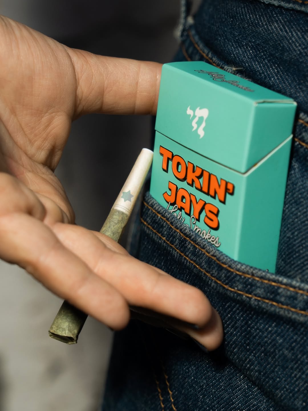
Tokin’ Jays Rolls Out High Spirits with Playful Packaging
By
Published
Filed under

By
Published
Filed under

It just makes sense for cannabis to inspire a few laughs. Tokin’ Jays leans into a retro-stoner angle, borrowing cues from 70s rolling-paper packs and old-school bodega signage.
Designer Mitch Wiesen pairs chunky, cartoon-forward lettering with a candy-box layout. The color palette swings from pastel gradients to loud primaries, each strain getting its own designated hue, all of which are complete with cheeky one-liners tucked into the packaging. The more you look, the more wit you find.
Get unlimited access to latest industry news, 27,000+ articles and case studies.
Have an account? Sign in