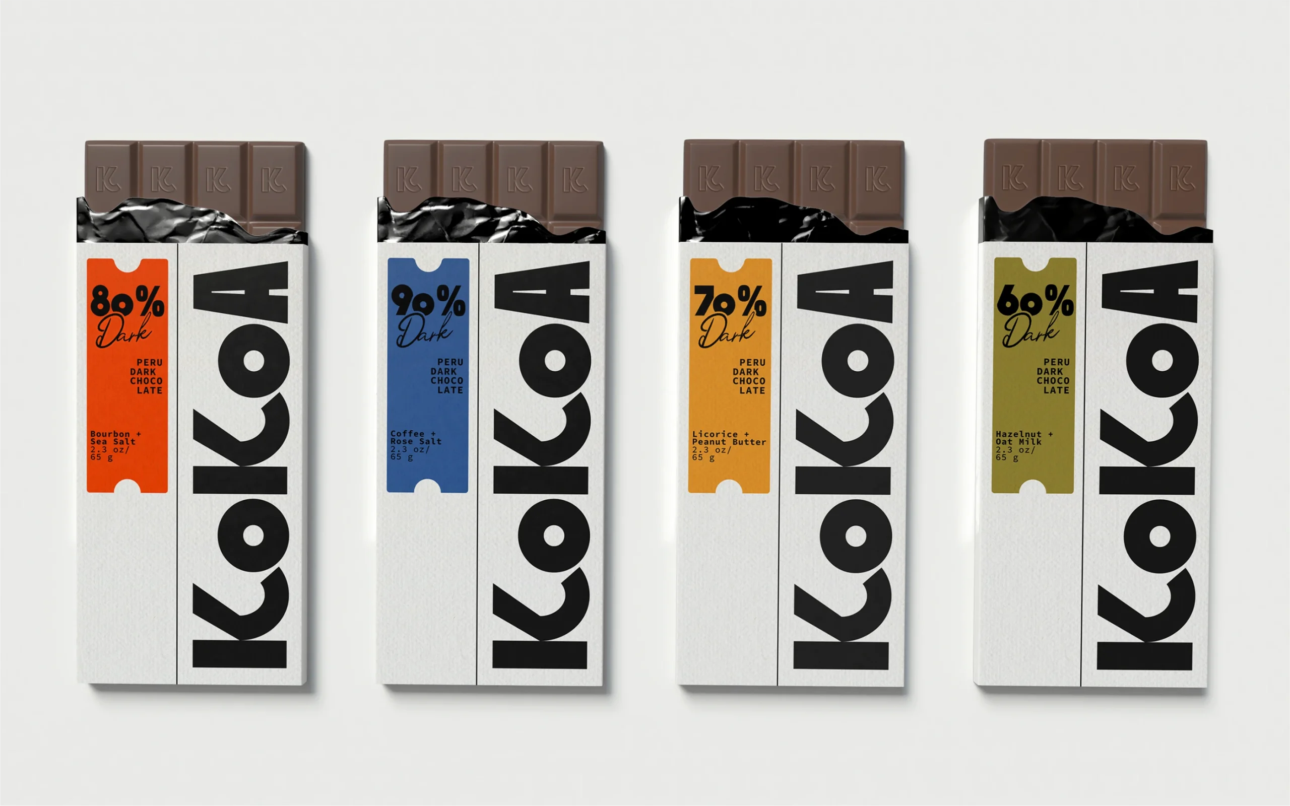
KoKoA’s packaging is all about the oversized letterforms stretched across the wrapper like a billboard and a vertical flavor strip that looks like a ticket. Kate Davydov leans into big geometry, assertive black type, and a single hit of saturated color to frame each chocolate bar.
In a category crowded with foil flourishes and the same old product photography, KoKoA stands out by treating chocolate like it should be: fun. Davydov shares more about the design process below.