Bellwoods Brewery’s Diff Diff Same Nails the Art of Craft and Contrast
By
Published
Filed under

By
Published
Filed under
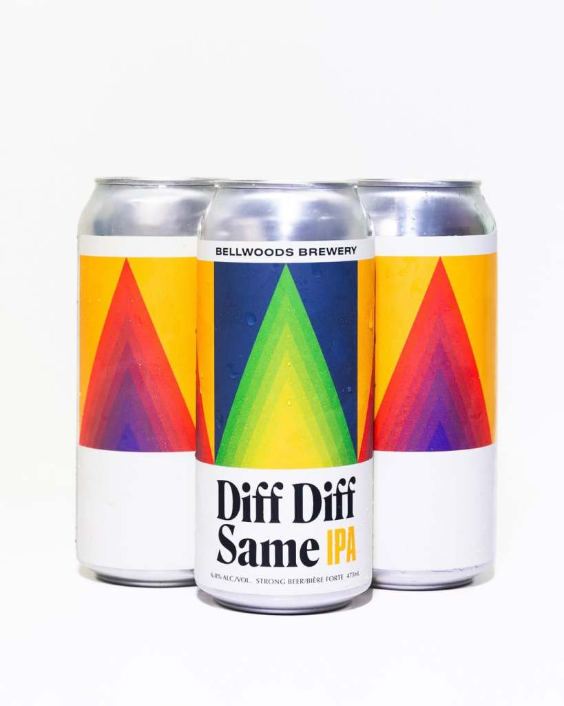
Doublenaut’s design for Bellwoods Brewery’s Diff Diff Same IPA plays with rhythm and repetition the same way the name does. The geometric arrows feel like they’re in motion, shifting through gradients that pull you forward and back, while the typography grounds it all with a no-nonsense serif that feels confident next to the color chaos. It’s minimal, but the label finds balance between structure and spontaneity.
Get unlimited access to latest industry news, 27,000+ articles and case studies.
Have an account? Sign in