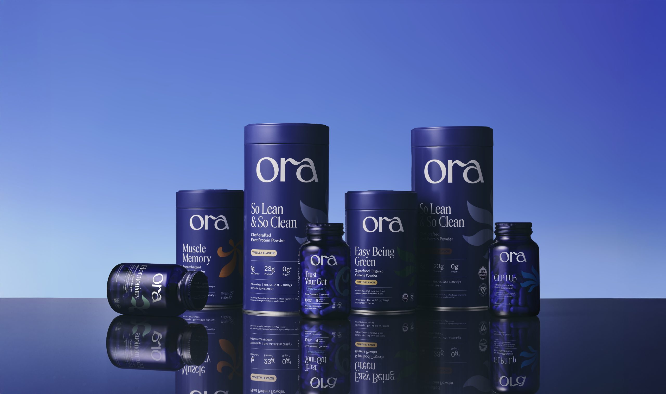
Ora’s rebrand, designed by ROMAN KLIS, leans into a deep cobalt palette. The typography pairs a soft, looping “ora” wordmark with sharper, serif product names, creating a hierarchy that’s easy to scan. Subtler elements, like the oversized letterforms across the bottles, add texture without becoming cluttered. It’s a clean, tightly structured system that prioritizes clarity while still feeling elevated.


