Magma Turns Up the Heat on Hot Sauce with Fiery Design Flair
By
Published
Filed under

By
Published
Filed under

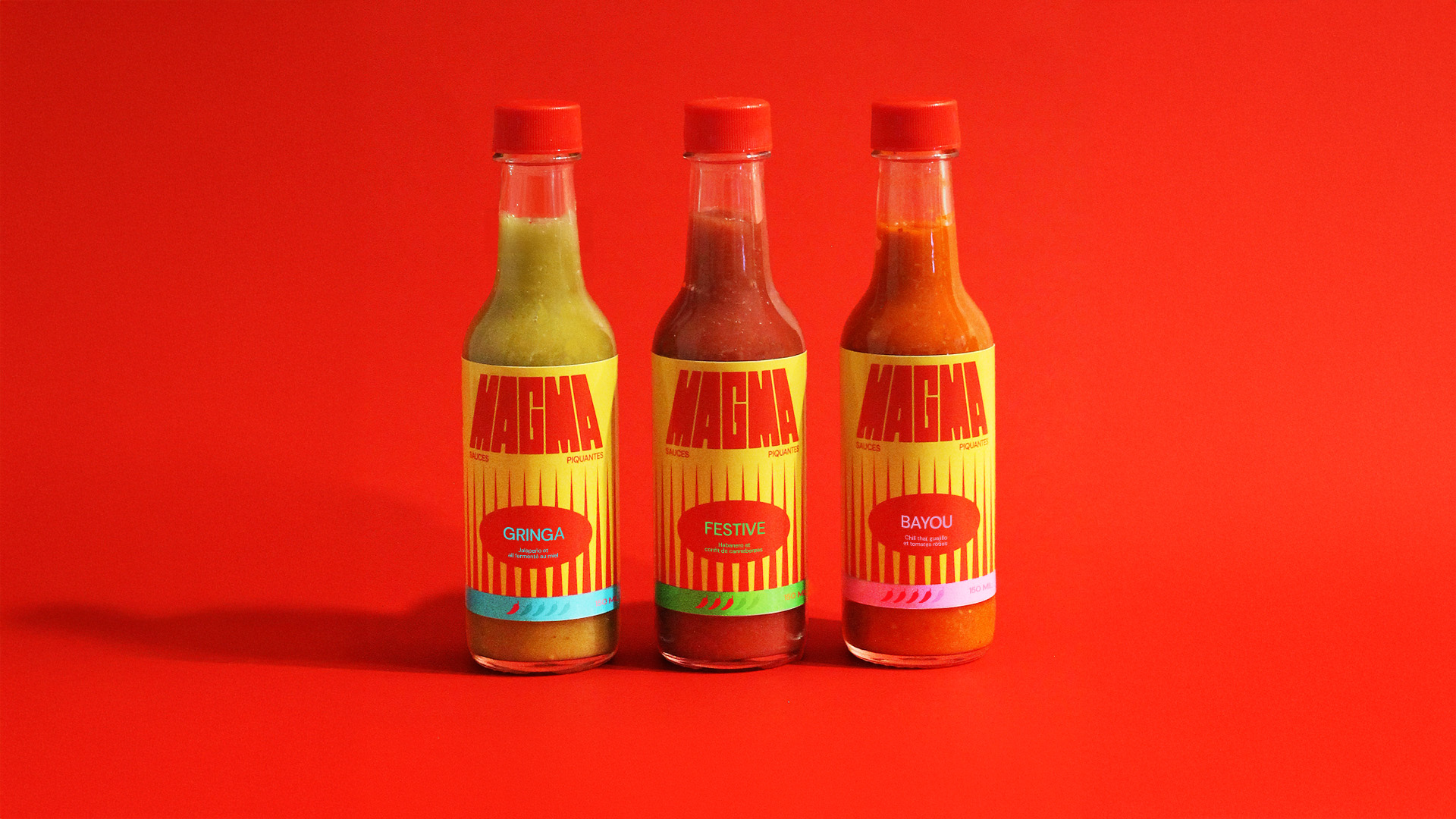
Magma Hot Sauces gets a packaging system that feels ripped from a late-’70s gig poster or a cult-classic grindhouse title card. It’s loud, graphic, and impossible to ignore in all the best ways.
Designer Sarah-Jeanne Turgeon leaned into stretched, blocky typography that looks like it’s melting under its own heat, paired with vertical, flame-like strokes that read almost like they belong on a retro sci-fi set. The neon accents, including teal, lime, and hot pink, break the category’s usual black-and-red monotony, giving each flavor a distinct signal. It’s clear that this is a hot sauce, but it’s definitely easily differentiated from the mass-market brands.
Get unlimited access to latest industry news, 27,000+ articles and case studies.
Have an account? Sign in